
Salam. As you can see, I’ve just uploaded my brand new theme. I call it as Binafsha Theme, which means purple in Uzbek.
Basically, its a two column theme. I’ve chosen this style because I want to put more things on the sidebar. Besides that, I’ve also has shown entire post. For a longer post, you can click ‘Read more’ to view the rest.
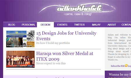
Content Slider
The unique cool thing about this theme is the Sliding Content on top part of the blog. You can click on the category tabs, which is Blog, Personal, Design and Event. Twitter tab is for my twitter updates and Malay tab is two latest entry from my Malay blog, Warna Kehidupan.
More white space and justified content
I was influenced by the printing media. The same goes for a blog design. It should have plenty of white space for the reader. This time, I used justify align to make the paragraph aligned, just like when you see in the magazine.
Problems
Yes, there are some problems because the theme is 90% ready and I just can’t wait to release it to see how its gonna look on the web. Finally, I’ve spotted some error when using IE7. I will fix it later.
Here’s the resources and inspiration for my Binafsha theme.
– Core77 website
– WP Framework
– Coda Slider Effect
So, what do you think?
abg add mmg ske pepel ka?
sesuki xD latest post: rosak.
yep. abg ske guna purple dlm blog. cantik kan?
agk menarik la.. how about pepel cadbury len2 kali? xP
sesuki xD latest post: rosak.
Em. nak buat cadbury ke? sedap gak.. orait. gud idea!
er.. bila mau update da..
abg add mmg ske pepel ka?
sesuki xD latest post: rosak.
yep. abg ske guna purple dlm blog. cantik kan?
agk menarik la.. how about pepel cadbury len2 kali? xP
sesuki xD latest post: rosak.
Em. nak buat cadbury ke? sedap gak.. orait. gud idea!
er.. bila mau update da..
owh motif la kan kita sama2 baru tukar blog layout.. hehe….
nice!
Szakif latest post: This is a Confession
yep. aku da pasan da layout ko pun berubah. tiada lagi panda yang pandai kungfu..
tapi aku ske design sendiri. puas ati sket.. hehe
owh motif la kan kita sama2 baru tukar blog layout.. hehe….
nice!
Szakif latest post: This is a Confession
yep. aku da pasan da layout ko pun berubah. tiada lagi panda yang pandai kungfu..
tapi aku ske design sendiri. puas ati sket.. hehe
ooh..binafsha eh? tbe2 cm tajuk lagu waheeda plak..hehe..
amat ske d fresh neat look..tampak kemas bergaya..ooh siap letak pic mencapap tu..
yep. saje je letak nama binafsha. pening pikir nama yang sesuai (mcm tak sesuai pun) hehe..
thanks for the compliment.. kemas kan? tapi ada org tak setuju plak kemas2 ni.. ish3
just my personal view..
background, would be nicer if got some pattern
menu/index, try making it bold? it seems a bit kurus lol imo la hehehe
and lastly.. too much fonts hehe (and it’s always.. arial/verdana size 10/8 times new roman or yg sewaktu with it size 12.. kan?)
in ur entry, not sure what font, but it does look big – i resize my page font size but then the right part jadi super kecik hehe
that’s just what i think la 😀
overall.. not bad.. nice one dude! 😀
Adila latest post: Goodbye Michael Jackson~
first of all, thanks for the ideas and suggestion. really appreciate it.
too much font eh? I bet there’s only Georgia & Arial with various style applied.
Sorry if the big font size bothers you. I’m afraid when screen resolutions become’s higher (especially widescreen) then my text will looks smaller.
that’s among the reason why I put it big. Easy to read. haha..
Anyway, I’ll do few changes soon. Thanks for the comments k!
at first glance, looks very clean and professional. suits ur credibility.
lps da diperhati:
da post header is too blank. kalau header bar tuh gradient pun, cun gaklah.
and tersgt kotak segi jer.. sgt boring. mcm takder designer’s touch. mcm fill in da colour jer. kalau rounded rectangular, nmpk smart skit.
overall, alan mcm main edit code colour jer.. takder apply design langsung. kalau nk simple2 minimalistic pn, at least add gradient kat hover bckground ker.. nmpk more stylish rather than solid colour nih jer or the other way round. sbg adikmu yg comel, first time anis sangat tak puas hati ngan ur work. hahah. sorry tak sempat comment byk2 before alan upload layout nih. xP
adikmu latest post: Saja
Time abang tak siapkan lagi, bukan nak komen. da siap banyak komen plak bdak ni. tau pun.
okey. takde masalah takat gradient je. satu hari bleh siap. haha..
eh byk plak komen rakan2 n adikmu itu..
to me it looks nice, neat, professional, n it suits u.
it is a design. sape yg ckp ini x nmpak mcm design, ketahuilah, dis is a design.
i mean square is d new round rite? cool.
asal kamu tukar layout baru je kompom aku akan down seminggu….
giler cun seyh!
purple lagi plak tu! haisyyy…
*jeles 100%*
pasni aku order kat kamu jla layout blog aku tu…huha~
thank you very much for the compliment. as always, purple is my official blog colour. hehe
kita kan style lain2. tapi boleh je nak order.
coding blogspot fail sket la. hee
jangan down2 ye. aku lagi jeles dgn org yg sentiasa tukar2. aku tukar setahun sekali je kot..
Chazzie Fairuz Fangirl ———-> nice name u gave me.. *peluh besar* =.=”
em. I’m thinking of changing from fangirl to ‘Chazzie Dorkistic Design’
boleh promote sket keje2 design.. hee
Chazzie Fairuz Fangirl ———-> nice name u gave me.. *peluh besar* =.=”
em. I’m thinking of changing from fangirl to ‘Chazzie Dorkistic Design’
boleh promote sket keje2 design.. hee
owh..tbe2 sudah berubah wajah!
this one mcm lgi graphical..tp kte lgi ske yg dlu..btw terer la buat…:)
tiba2 berubah wajah dah kan?
ape yang graphical nye.. plain je. tak pki photoshop sgt pun..
thanks for the compliment! alhamdulillah
owh..tbe2 sudah berubah wajah!
this one mcm lgi graphical..tp kte lgi ske yg dlu..btw terer la buat…:)
tiba2 berubah wajah dah kan?
ape yang graphical nye.. plain je. tak pki photoshop sgt pun..
thanks for the compliment! alhamdulillah
Pingback: Tips menggunakan tema Wordpress percuma | AdlanKhalidi